Colgate Palmolive
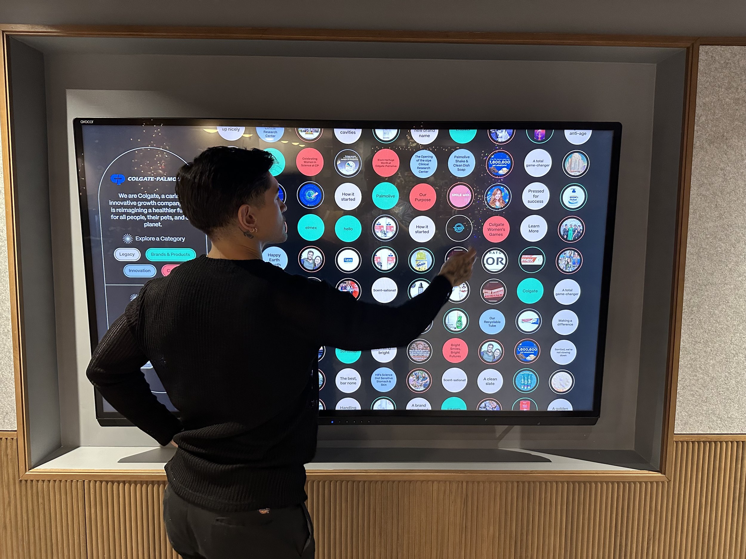
Colgate wanted to elevate their New York City corporate headquarters with an engaging, interactive touchscreen experience designed to captivate both visitors and employees. My team and I designed a dynamic digital installation that would serve as an immersive database, highlighting the brand’s rich history, heritage, and diverse product offerings.

My Role
UX/UI Designer
Agency / Team
CMYK
Sr. Designer, Project Manager, Design Director, Development Team
Skills
UX/UI, Interaction Design, Graphic Design
Project Scope
Interactive Touchscreen
Project Brief
To design an interactive touchscreen that showcases Colgate's history and culture, enhancing users' understanding of the brand.
Key Objectives
Organize content + media in an enriching and chronological way.
Visually reflect Colgate’s revamped brand identity.
Educate visitors and employees.
Aligning our design with Colgate’s revamped visual identity.
Since this touchscreen would be installed in Colgate’s HQ office, the user interface needed to effectively align with their updated visual identity in a coherent and visually appealing manner.
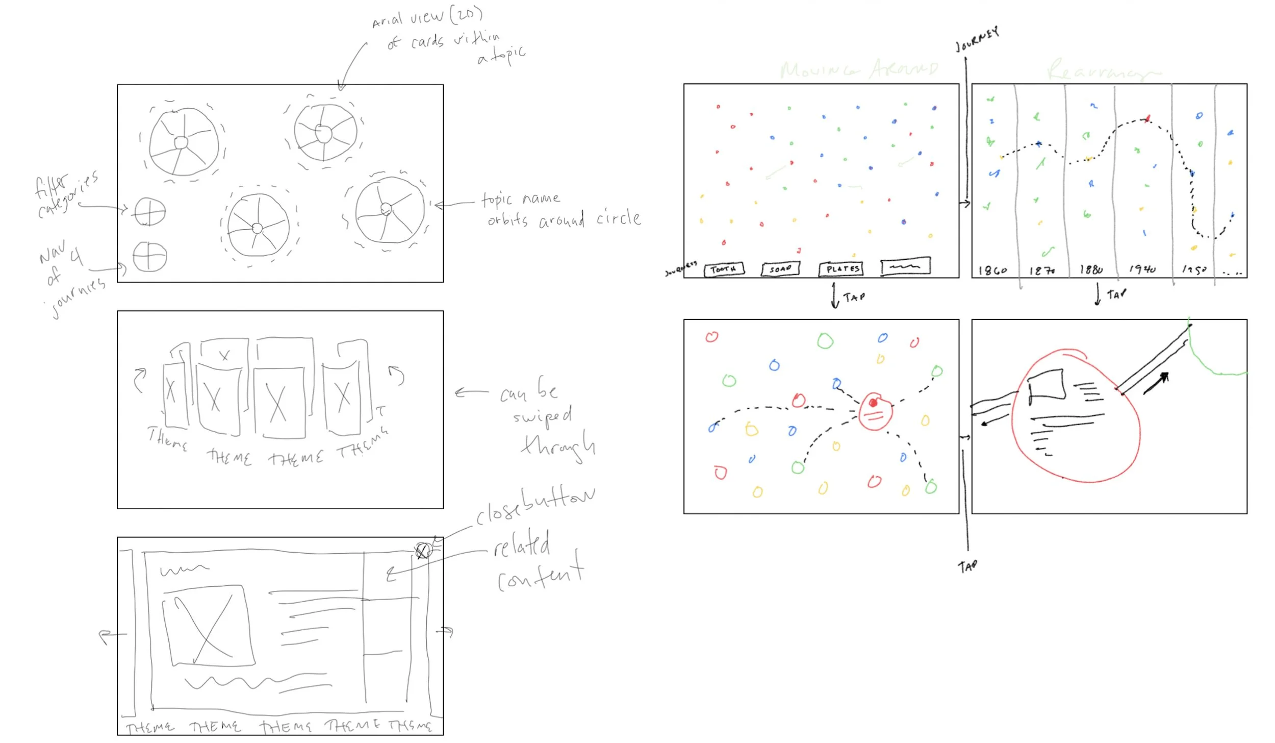
Brainstorming ways to organize content by category, chronological order, and related media.
All the content and media needed to be organized by “stories” or four categories - “Legacy”, “Brands & Products”, “Innovation”, and “Culture”. My team and I brainstormed different layouts that would work best for this situation.
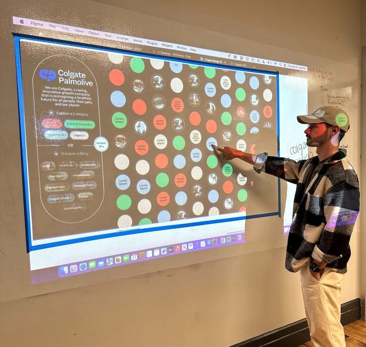
The proposed solution is a dashboard with bubbles of content, allowing multiple user journeys.
The interface had to be intuitive to ensure that users could effortlessly discover the brand’s stories and related content, in chronological order as well. Therefore, we decided to go with an interface that incorporated a dashboard menu and passive bubbles of content.
Users can discover information by clicking on the bubbles or selecting from a category or story on the dashboard. Selecting a category or story would trigger a rearrangement of bubbles in a snake-view, ordered in chronological order.
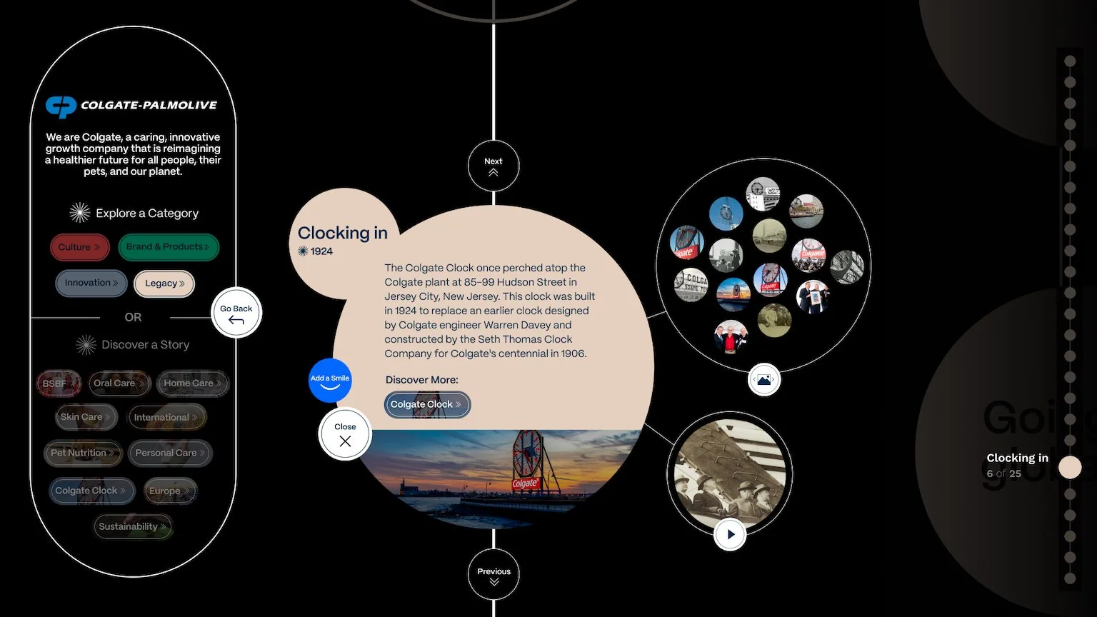
Users can explore a detailed view of a specific category bubble, accessing associated media content. They can navigate between adjacent content bubbles using "Previous" or "Next" buttons.
Additionally, I implemented a progress bar on the right side of the screen, allowing users to easily track their position within the experience.
Considering accessibility, text size, touch targets, and height.
I opted to go with a vertical layout for the content rows, taking into consideration the user's height and ease of accessing all the content bubbles. We tested various touchscreens from museums and concluded that simpler triggers and gestures would make for a better experience.
Incorporating valuable user feedback and haptics to enhance the overall experience for users.
Throughout the entire experience, we thoughtfully incorporated several “surprise and delight moments,” including the option to react to content, as well as animation bursts that are triggered at specific points in the interaction.
The Outcome
Through a well-crafted narrative structure and intuitive design, my team and produced an engaging and delightful interactive experience. Our approach offered a range of potential user journeys, deepening the connection and understanding between Colgate Palmolive, its visitors, and employees.
Key Takeaways & Impact
Accessibility informs design: the touchscreen had to consider users of all abilities, including considerations for height, motor skills, and visual impairments (touch target sizes, font sizes, and high-contrast visuals).
Simple gestures are better: after testing touchscreens at museums, we found that gestures such as pinch and zoom were often glitchy and not necessary.
Micro-interactions and haptics can enhance the experience: utilizing icons, animations, and progress indicators can guide users through the experience while providing feedback.


